Virtuosa — Visual Identity for a Jazz Festival
Project Type:
I was interested in how visual design could support a music experience shaped by identity and intention. Jazz, with its history of improvisation and expression, became the starting point—especially through the lens of women whose contributions often go unrecognized.
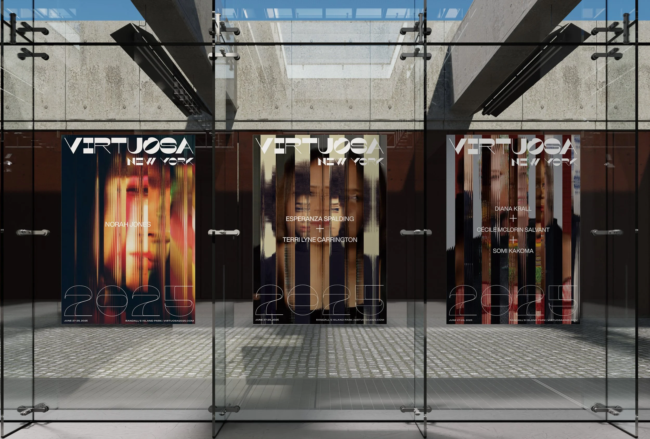
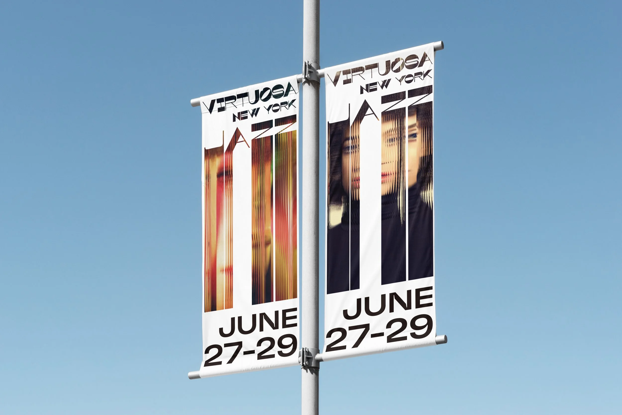
Virtuosa is a three-day outdoor jazz festival featuring an all-female lineup. The project explores how graphic language can reflect presence, clarity, and rhythm through layout, typography, and color. The name and identity aim to balance a sense of structure with musicality, supporting both the audience experience and the values behind the event.
Visual Identity, Event Branding, Motion Design, Web Design, Print Design, Social Media Content

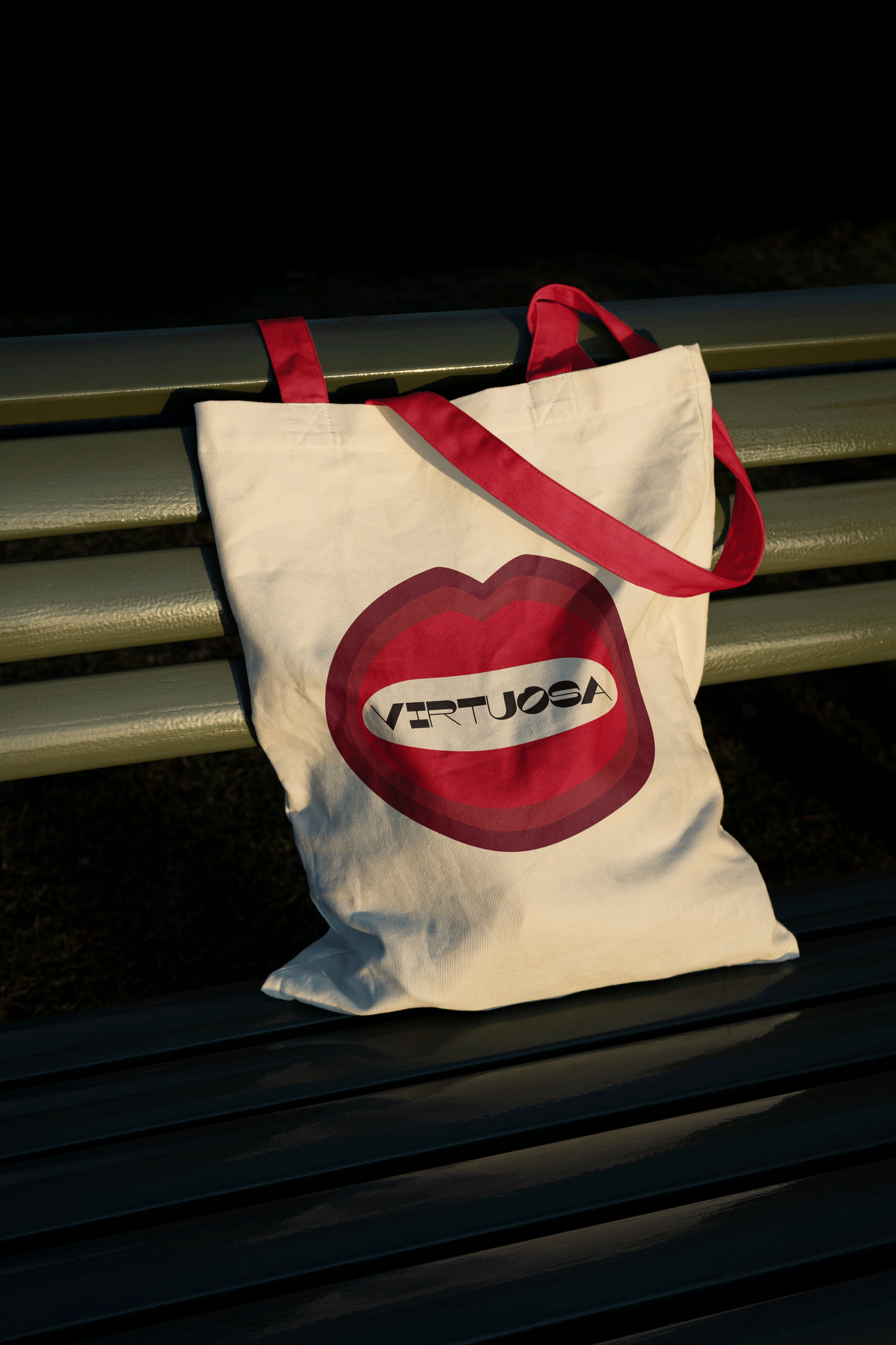
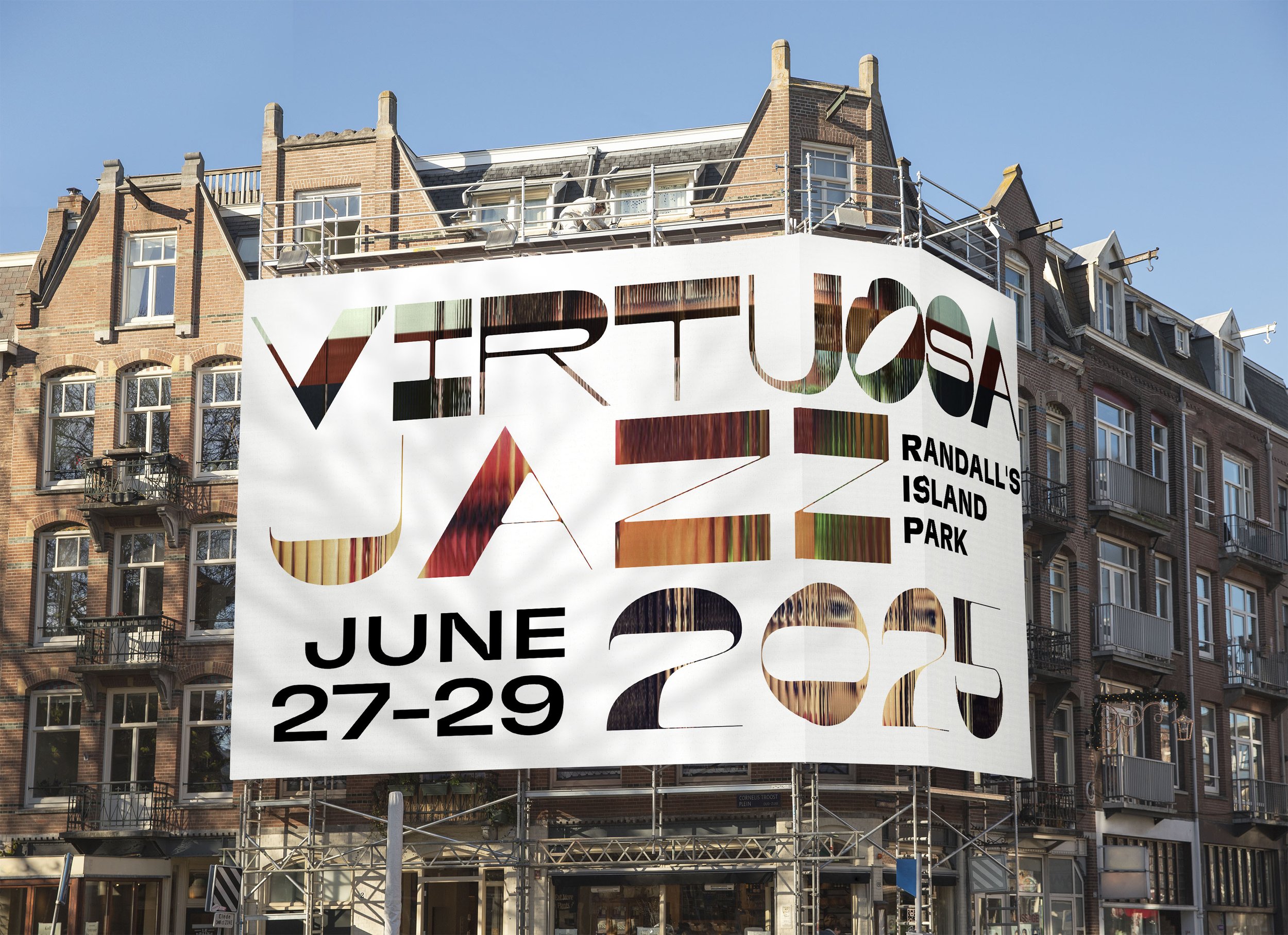
The name Virtuosa references a feminine form of "virtuoso," and was used as a starting point to explore visual language around performance, and presence in jazz. The letter “O” was intentionally shaped to resemble a mouth—subtly referencing voice, performance, and the festival’s all-female lineup. This form was also extracted and adapted as the basis for the event symbol.
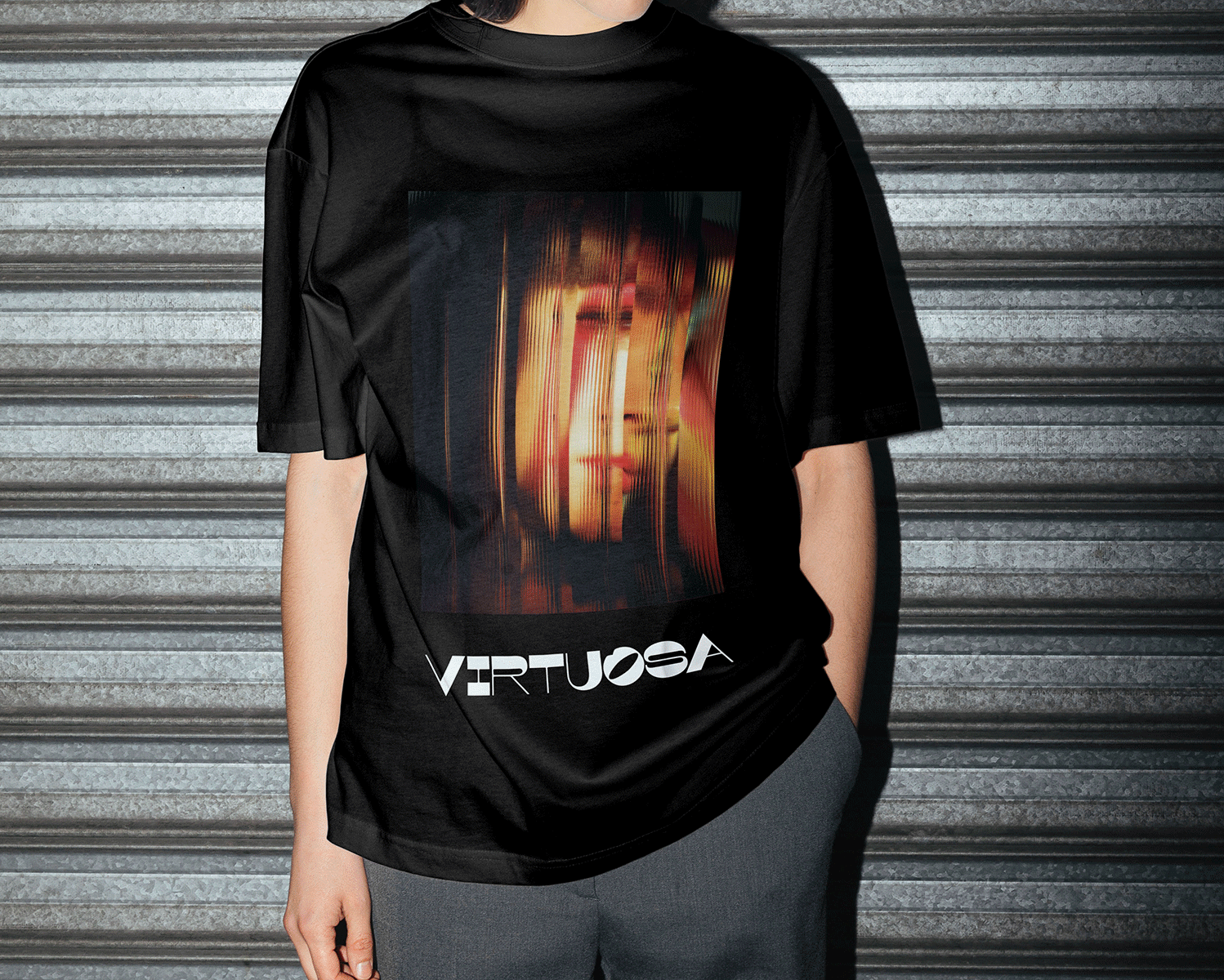
To establish a distinct and expressive identity, the logotype uses Maelstrom Sans Bold by Klim Type Foundry. Its strong contrast and geometric tension offer visual character while allowing for symbolic customization.
GT Flexa, designed by Grilli Type, is used for body text and digital materials. It provides clarity across formats while maintaining visual continuity with the tone set by the logo.


This video uses grid-based masking to reveal images in response to music. It appears as a background on the festival website and the main screen on stage.


